Ink
Leopard
Triangle Jelly
2014
Collection of Illustrations
Sci-Fi Cactus | Illustration
2015
Animal Skin Product
Creature Products
Jungle Products
2016
Mario Olives Can
Designed a package adapting a 2D design to 3D forms, both simple and complex. Explored materials, aesthetics, production methods, marketing objectives, and budgetary constraints.
Bamboo Products
3D #4
2017
2018
3D #8
3D D
3D #1
2019
3D #5
3D #6
Spring Season / Badge Design
3D B
3D #7
2020
3D A
BRAND HERE | Label Design
Designed a concept for a package label concept using the word BRAND HERE with abstract patterns.
3D #2
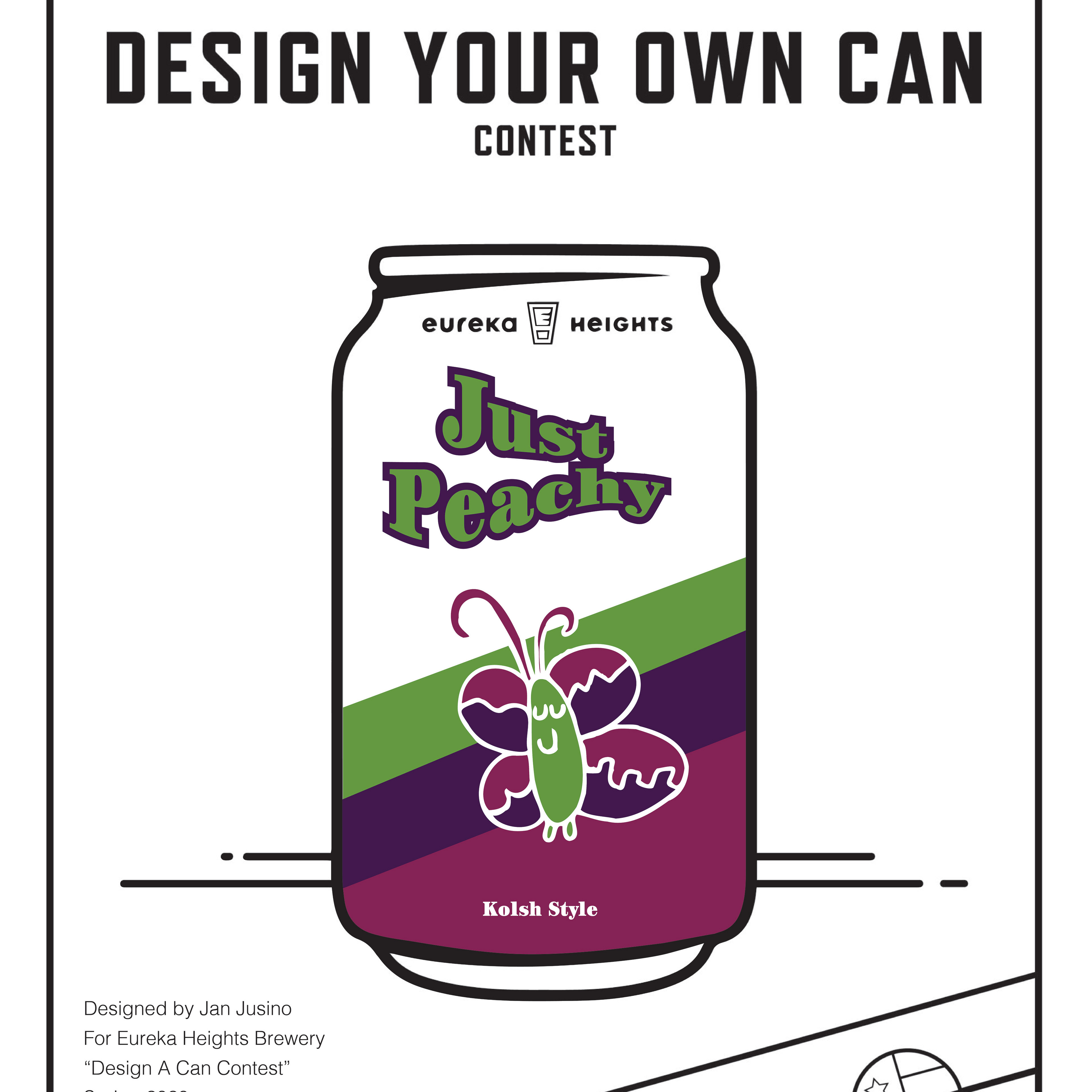
Eureka Heights
Participated in a label contest and submitted this label design for a seasonal product.
3D #3
Paper Package Design
Paper packaging goes beyond a simple product label in that a package can house the product, convey the brand, stack in a planogram, nest inside a box carton, offer multiple vantage points, open easily, and have closure. Instructor: Michael Bulsiewicz
3D #9
2021
Type Classification Cube Box
Since the time of Guttenberg, the typographic form has evolved through technology, philosophy, and culture. In order to effectively analyze this typographic evolution, type design has been broken down into classifications of common visual characteristics. Instructor: Michael Bulsiewicz
Untitled - December 18, 2025 13.34.12
Untitled - December 18, 2025 13.38.30
Plátanos amarillos
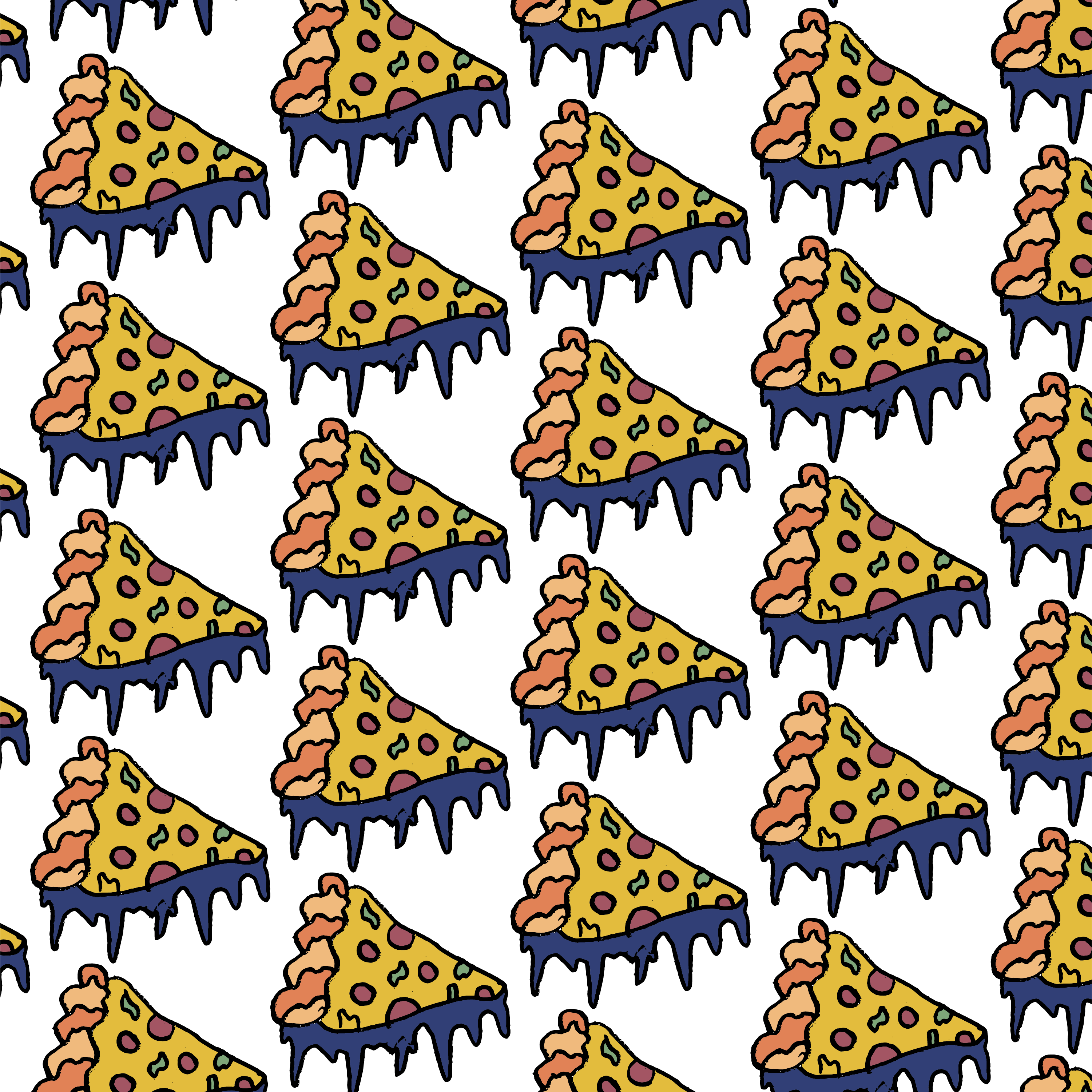
Flying Pizza | Illustration
Tranquility
Venom
Rakes
Simple Coffee
Tranquil path over stones
“Lily in a pond”
Eye of the tiger
Table
Untitled - July 28, 2024 14.42.35
You are perfect
Bear
Monkeys
Visual unity of monkeys and typography.
Happy 15th Birthday, Dribbble!
Leopard
Birds on a loop
Blends
Snail on cactus
Dándoles
Blue sky
Bank of flowers
Pink dolphin
Sloth
Evening Scape
“Ciclos”
Cloying Owl
Stagger
Dragón
Edificios
The thinker
Mando and Yoda
Houston Building
Ve.4
Tea Time
Dangling Flower
Monster zinc
Radials
Ginny
Nature Stands
Paradise
Zendo
Soccer Player
Crib
Sol in Space
Village
Fire Metal
Triangle Jelly
Flower harvest
Rosen Dager
Bonsai
Eyes Chakra
Untitled - August 2, 2022 22.12.22
Time
Lost Toy
Flower
Aliens Collection
Gremlin
Abstract Triangle
Python
Lotus
Squares
In this project, I created 8 unique designs using black paper-cutted squares on white Bristol board. Most squares are overlapping, addressing to the Gestalt principles.
Dust
Statue
Animal Skin
Pond
Color Book
Foliage
Bamboo
Flowers During A Sunset
Tower
Dotted Patterns
Skyline
Green Dotted Pattern
Engravings
Progression
Created a six design art piece that shows progression through storytelling. Inspiration Jean-Michael Basquiat, a painter of the widely celebrated Neo=Expressionism art movement. He brought together in his art disparate traditions, practices and styles to create a unique kind of visual collage, origin rom urban and African-Caribbean heritage. Instructor: Chris Thompson
Personality Logo
Road Signs
The Complete Sign
Figure Indication
Established scale and proportion in drawings to indicate active size of objects using figures to indicate establishment. Inspirated by Claes Oldenburg
Type as Image
Designed self-portrait composition using only typography as visual elements base on photography and use typography that helps express your identity as a designer. Instructor: Michael Bulsiewicz
Emphasis and Scale
Eight designs using rectangles, squares and circles. Each are unique, engaging, compelling, and appealing. A point of focus appears in all eight of the designs.  Inspiration Kasimir Malevich, founder of the artistic and philosophical movement of suprematism. Idealist who constitute the theoretical underpinnings of non-objective, abstract art. Worked on the exploration of pure geometric forms and their relationship with pictorial space. One of his most important art Black Square (c. 1915). Instructor: Chris Thompson
Resistance Series
Apple
Familiar Logos
Designed a ubiquitous symbol using a UPC "Universal Product Code" to solve a memorable graphic. Instructor: Black Miller
Perfect Star
Designed a five-point star with how I perceived its meaning. The star may appear to be simple, yet is complex and dynamic.
Clarity Series
Sound Problem
Idealized and designed a visual perception of audio perception and translated into visual representation.
Columns Illustrations
Brand Collage
Triangle Energy
Gothic Torch Illustration
Inspired by gothic style torches and middle age color palettes applied.
Abstract Blending
The Heart - 3D Illustration
Try It Out (A Balance and Rhythm Digital Series)
Ghost
Flying Portrait
Match Box
Decorative Logos
Album Cover
Surreal House (Illustration)
Expressive Type
Letters are not just abstract notions, they are carriers of meaning; they are also real physical shapes. Paying attention to those shapes, and using them as a visual element in graphic design is an essential part of the art of typography. Inspiration: Herb Lubalin in New York and Massin in France Instructor: Michael Bulsiewicz
Type Specimen Book: Letter ABC
Font: Deutsch Gothic
Magic Swift
Type Specimen Book: Letter DEF
Font: Deutsch Gothic
Form and Patterns Poster
Source of inspiration: Christpher Radl and Valentina Gregoria, Actual poster "Memphis Logo Designs", early 1980. The "Memphis Logo Designs" gave a vocabulary of form and pattern in a series of typographic expression.
Houston Rodeo
Designed a magazine spread for the Houston Rodeo using images, colors, illustrations and typography that relates with the show.
Event Poster
Layout a teaser poster to promote the Super Bowl 51 event in Houston. Researched previous Super Bowl promotional materials, and used inspiration from previous events to explore imagery, appropriate typography, and composition to create an effective promotion to build excitement for this world-class event. The following compositions are considered on compositional variables like balance, contrast, dominance, emphasis, movement, proportion, repetition, rhythm and unity to help organize elements within the layout.
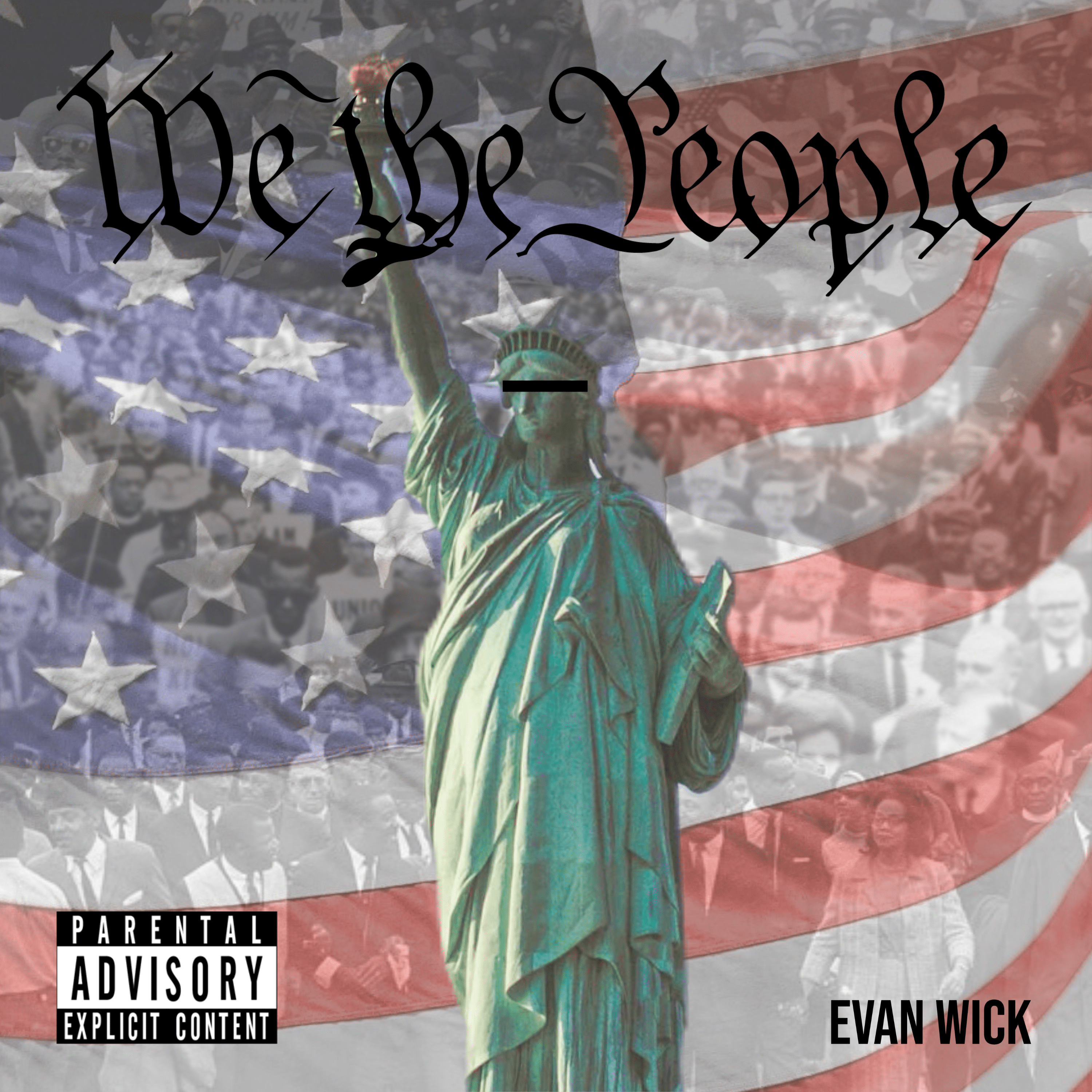
We The People
Cover Art designed for singer and music writer Evan Wick for his next release title "We The People".
Exhibition Poster
Source of Inspiration: Willi Kunz, photography exhibition poster, 1978. A dynamic equilibrium between diverse parts is achieved.
Design Vocabulary
Created a vocabulary based on the importance of Design History.
Magazine Spread
Pyeong Chang Olympics
Designed a poster for Pyeong Chang Olympics using the Unigrid system that is best used for mapping and organizing information.
Ai Brochure
Designed a trim-fold color brochure for the Art Institute of Houston showcasing the main campus and its academic life and areas of study of Graphic Design. The brochure communicates the essence of the subject, informative and enticing to potential students.
Typography Timeline
Design and highlight important perspectives on the History of Type. Instructor: Michael Briere
Typographic Permutations
Experimenting with type placement using the grid.
Magazine Cover
Hemisphere
Created a logo conceptualized from the word Hemisphere.
Digicomm Owners Manual Book
Information design is used to convey statistical information to the viewer. The data is presented in a way that engages the viewer without the use of over done charts and spreadsheets. Instructor: Zack Zwicky
Shopping Cart
Concept designer a shopping cart considering aspect of grocery shopping (aisle width, children, other shoppers, stacking, safety, environment, materials, etc.) Instructor: Blake Miller
Awareness Poster
This project subject awareness to combat a popular negative behavior of reckless driving. Instructor: Dr. Scott Sheinfeld
Concert Poster
Our job as visual communicators is information design, or the conveyance of ideas or messages in an organized and meaningful way. There are many to achieve this goal, but we will utilize form, space, and structure. In this assignment I explore various typographic hierarchies and visual structures to convey the required text using the six design variables in a grid-based composition. Instructor: Michael Bulsiewicz
Historical Event Poster
Challenged to create a movie poster for the Buffalo Bayou Partnership Regatta using a story any news agency has reported of the content. Instructor:L Dr. Scott Sheinfeld
PABST Can Art Contest 2021
Designed three layouts for PABST Art Can Contest. The chosen design will be featured on millions of PABST cans.
Mailer Poster
Created a mailer that folds out to a poster. The topic is choosing a student from class and tell interesting facts about the student in the poster. A diagram will be the primary visual focus in the piece, technical or experimental in nature. Images and text, and body copy are used. Instructor: Zack Zwicky
Diamond Font
Family Font designed by constructing a grid to classify each letter and symbol. Geometric connections that expose rough edges reveal a diamond shape.
Diagrammatic Mailer
Created a mailer that folds out to a poster. The topic is some kind of action with a mechanical, none electric, handheld object. A diagram will be the primary visual focus in the piece, technical or experimental in nature. Images and text, and body copy are used. Instructor: Zack Zwicky
The FAA
Designed a social issue topic and develop a single vector narrative from an image showing a statistic note. The poster and marketing materials serves as the key visual to launch a guerrilla marketing campaign and raise awareness.
Digital Illustration
Illustrated Words
Designed for Book/Poster Covers using words as subject or object: horn, fork, light, crane and fence. Instructor: Blake Miller
Invention Poster
Invented and designed poster that conceptualizes a product for consumers, identifying how to use it and potentially pitch a good selling point with the simple use of imagery and text
Typographic Workshop Poster
Source of inspiration: Willi Kunz, typographic workshop poster, 1974. The International Typographic Style is supplemented with the use of a strong diagonal.
Univers St Poster
Bold Crab Logo
Film Cover
Mystic A1 Notary Logo
Magazine Cover
Type Anatomy
As with any craft that has evolved over 500 years, typography employs a number of technical terms. These mostly describe specific parts of letterforms. It is imperative to familiarize yourself with the lexicon. Knowing a letterform's component parts helps develop the designer's critical eye. This makes it easier to identify typefaces and recognize the underlying structure of type design. Instructor: Michael Bulsiewicz
MFAH Postcard Design
Designed a postcard to promote the Museum of Fine Arts in Houston.
Design Movement Poster
Vernacular refers to the everyday speech of people. As designers, when we use a particular visual style for design work, that applied approach is what we refer to as using a visual vernacular. In his project, I explored several design movements from the twentieth century, selected one, and applied its visual vernacular to a poster communicating the high points of that particular design approach. Design Era: William Morris and Kelmscott Press Instructor: Michael Bulsiewicz
TImeline Design
Created a timeline based on the importance of Design History. Instructor: Charlotte Card
Legendary Family Music
Designed a logo for Music Record Studio, Legend Family Music.
Exhibition and Symposium Poster
Source of inspiration: Kenneth Hiebert, exhibition and symposium poster, 1979. A formal grid structure is implied, but a playful intuitive process of form exploration led to unexpected relationships.
Custom Alphabet Poster
Designed an alphabet inspired by constructivism art.
Finest
Designed a cover art for a song titled "Finest". Client's Instagram: @neoninstrument https://www.instagram.com/p/B2y4tdxgsYY/
Stationary Presentation
Jacobs Company
Designed a logo for a Sustainable Campaign by Harry Rodriguez. The campaign aims to build a sustainable plan that will bring awareness to ecology.
UP Logo
Letters "UP"
Ismael Jusino Law Firm
Designed a logo for a law firm, Ismael Jusino Law Firm. The visual approach in the logo defines what the business does and who is the attorney.
Bat Hats
Designed a business card for Bat Hats.
Refugee Crisis Poster Campaign
Assigned to design the social issue topic and developed a single narrative vector/raster image with a statistic note. The poster serves as the key visual to launch a guerrilla marketing campaign to raise awareness for an audience.
Texas Sun
Art Portfolio
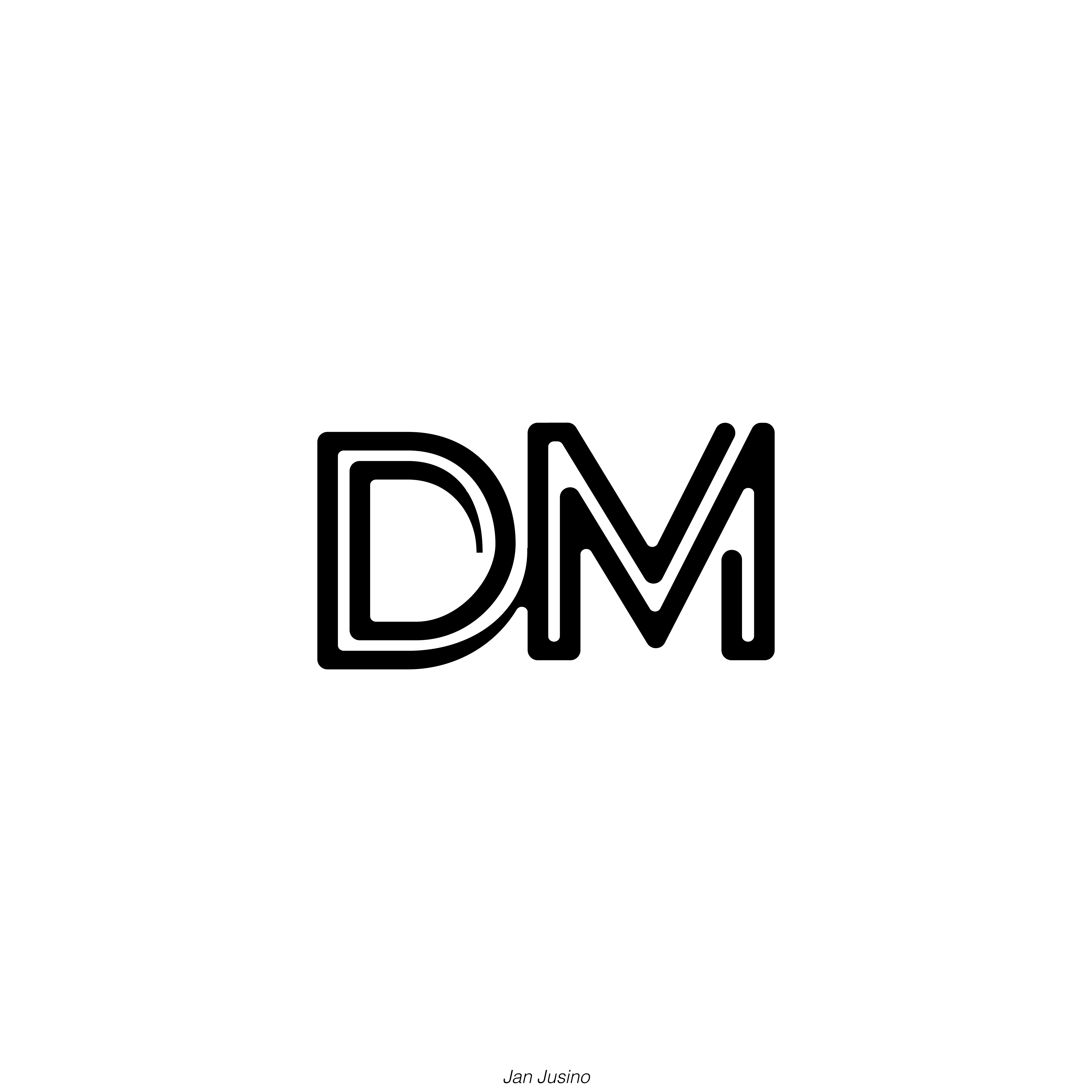
Lettermark
A lettermark is a wholly typographic mark or logotype that usually involves initials or abbreviations, it is sometimes referred to as an alpha-glyph. Monograms are an example of a letter mark. The representation of the letters become symbolic of an individual or an association. Instructor: Michael Bulsiewicz
Poster Heroe Competition 2020
In contemporary society, work represents not only the main means of subsistence for human life, but also the element capable of guaranteeing security, responding to the needs of belonging and self-fulfillment and defining the relationship between oneself and the others in a wider context. The world of work, however, in recent decades has undergone a very rapid transformative process and it has been influenced, on a global level, by a wide range of factors, with specific consequences in different territorial areas. For some years the International Labour Organization has introduced the concept of “decent work”, promoting a positive scenario in which employment is carried out in conditions of freedom, equality, security and human dignity for men and women, with self-respect, in well-being and guaranteeing personal development for each human being. These are all key requirements for the achievement of sustainable development and social justice. The Posterheroes competition, that has reached its 9th edition, aims to support ILO in the achievement of the Sustainable Development Goals of the 2030 Agenda, stimulating reflection on these issues.
Rounded Letter
In pencil, use circle tools (compass or circle template and ruler) to neatly create a perfect, rounded letter of choice. Instructor: Michael Briere
Type Hierarchy Sequence
Visual Hierarch is the arrangement of elements in a predetermined and graduated sequence of importance. Designers are tasked with communication of information such as names, titles, events, dates, locations, etc. The purpose of hierarchy is to communicate this information appropriately. In this project, I experimented with visual hierarchy by changing typographic variables in a composition using one typeface and upper and lower case characters making the letterform, body copy and title most prominent. Instructor: Michael Bulsiewicz
Puzzle Book
How puzzles are made? 
Film Poster
Grapes collection
Poster Quote
Spot
Vacation Banner
Paradise
Abstract
Flowers
Distorted pattern of flowers using the mesh tool.
Umbrellas
Bottle
Favela
Ancient Sphere
Twist
San-Serif Saying
Sketched out a hierarchical San-serif saying with various invented styles. Instructor: Michael Briere
Spots
Serif Saying
Hierarchical saying in a fairly basic Serif style. Instructor: Michael Briere
Stairs
Leaf
Subway Poster
Jeepers Creepers
The Bayou Review
Published artwork on The University of Houston Downtown's Fall 2019 Magazine Issue.
Dj Set
Web Site Architecture
Developed a web page design that is appealing and interesting for the end user as well as the client. Instructor: Bryan Key
Flowers
Interactive Boxes
Typeface Modeling
This sketchbook is designed to give designers an authentic, guided practice in observing and delineating a number of different styles of hand-drawn lettering styles to increase confidence, speed and accuracy, as they differentiate parts, weights and spacing requirements of individual type styles. Instructor: Michael Briere
Three Alphabet Prototype
In practice, a consideration of the three categories of hand lettering: Serif, San-serif and Script will reveal a different approach for each in terms of letter stroke. The most basic of these is San-serif because it is at its heart, non-ornamental, and because the rhythms for these forms are regular. Serif is bit more involved, since it also includes extra, serif strokes. The most involved may be Script, since its rhythms are often regular. Instructor: Michael Briere
Web Interface Design
Design a web application for promoting an upcoming event. Portfolio use only.
Interactive Circles
Web Wireframe
Web Coding
Designed, developed, and uploaded a simple web site using HTML and basic CSS. Instructor: JR Griffith
Ideograph
Ideographs combine pictographs to communicate more complex concepts and messages. Instructor: Michael Briere
Script Name
Created my name in a Script Style, with irregular rhythms and ornamental flourishes. Instructor: Michael Briere
Interactive Website
Designed an interactive website and conceptualized for a pet store. Instructor: Adobe Community Program: Adobe XD
Interactive Buttons
Letter Stroke Practice
Knowing and being well-versed in shaping the basic parts of any letter form, as well as the complete letter for any glyph, provides the essential framework for further development in drawing all kind of letters. Instructor: Michael Briere
Word Expression Chart
We all realize typefaces give different visual expressions, as though they each had unique personalities. In fact they do, and in employing their differences, we give words the many different kinds of clothes they wear. This projects presents the sam saying in many different ways depending on the typeface with which we clothe it. Instructor: Michael Briere
Hand-Drawn Manuscript
A replicate look of the Illuminated Manuscript with Initial caps, fine hand lettering and decorative artwork. The saying writes a modern or ancient approach to the the text.
Sign or Show Cards
Hand painted sign cards have been and will continue to be used by retail establishments to give immediate and timely, in store information of a specific nature for matters for the overall marketing strategy have not taken into account in the long term strategy of selling goods. They are often decorative to a degree, hierarchical with clear messages, and may contain simple illustrations that can convey flavor or mood to enhance the shopping experience. Instructor: Michael Briere
Capital Letter
Designed an Illustrative Capital Letter using a old Renaissance icon or symbol with an English (latin) letter of choice. Instructor: Michael Briere
Script Saying
This hierarchical saying is framed and designed to flourish script style. Instructor: Michael Briere
Overlap Letter
Superimpose or tightly overlap two of the same letters from similar fonts. Instructor: Michael Briere
Gestures
Created a dynamic still life drawing of objects.
Industry Logos
Perspective
Create composition of ideas using points (1-5) of perspective. Inspiration: Cartoons and Landscape Instructor: Casey Gregory
Geometric Logos
Blind Contour
Exercise eye hand and coordination and range of motion.  Instructor: Bill Willis
DVD Cover
Designed a cool PBS Cover for Frontline:The Merchant of Cools.
Thing Combines
Combine one living thing and one non-living thing to create a unique presentation. Instructor: Larry McEntire
Illustrated Word Game
Doodle from a Noodle
Object Stylization
Perspective/Drawing from Boxes
Chiaroscuro
Use heavy charcoal to reduce value of shade and tones. Instructor: Bill Willis
Branding Your Buddy
Illustrated Mind Map
A Mind Map is a powerful graphic technique which provides a universal key to unlock the potential of the brain. It harness the full range of cortical skills "word, image, number, logic, rhythm, color and spatial awareness"in a single, uniquely powerful manner. It gives your freedom to roam the infinite expanses of your brain. It can be applied to every aspect of life where improved learning and clearer thinking will enhance human performance. Instructor: Black Miller
Composition Standards
Make a series of designs that conform to the following composition standards. Inspiration Piet Mondrian, recognized for the purity of his abstractions and methodical practice. He radically simplified the elements of his paintings to reflect what he saw as the spiritual order underlying the visible world, creating a clear, universal aesthetic language within his canvases. Mondrian took interest in impressionist techniques like Van Gogh. Mondrian use pure, glowing colors and expressive brushwork under the influence of pointillism and Fauvism to cubism style of art. Instructor: Chris Thompson
Lines and Shape
Use Ink on White Paper to create five different designs that deals with the animal as follow the order from left to right: simplified, geometric/robotic, exaggeration, fit in circle and organic. Inspiration Frank Gehry, architect known for postmodernism. Known for use of bold, post-modern shapes and unusual fabrications. Also the launch of his "Easy Edges" cardboard furniture line.  Instructor: Chris Thompson
Space and Value
Using achromatic media I created six designs using a combination of any shapes and lines. Each are unique, engaging, compelling and appealing to rhythm. The rhythm apparentness progressive design. Inspiration M. C. Escher, Maurits Cornelis Escher, created unique and fascinating works of art that explore and exhibit a wide range of mathematical ideas. He worked directly from structures in plane and projective geometry, and eventually capturing the essence of non-Euclidean geometries. Also fascinated with paradox and "impossible" figures. His work encompasses two broad areasL the geometry of space, and what we may call e-logic of space. Instructor: Chris Thompson
Space
Introduce concepts by working with negative space and positive space. Instructor: Bill Willis
Type and Expression
Continue a composition design adding the phrase "Among 20 snowy mountains only the moving thing was the eye of the blackbird." Inspiration David Carson, creator of Ray Gun magazine, believes to never mistake legibility for communication. Carson's technique of ripping, shredding, and remaking legibility for communication. The appealing of grunge was based on a basic idea. He shaped everything in his path for his own purposes, endlessly contorting type, layout and grid into new configurations and abandoning design's established truths of order and legibility. Instructor: Chris Thompson
Balance and Rhythm
Seven designs using any size and any combination of geometric shapes. Each are unique, engaging, compelling, and appealing to rhythm. Rhythm is apparent to symmetric and asymmetric unity. (Created by Jan Jusino / The Art Institute of Houston / Prof. Chris / Fall 2015)
Extended Contour
Draw conform objects by drawing lines across the space. 
Value
Introduction to Value and how it creates Mass, Volumes, Space an Light. Instructor: Bill Willis
Colors
Exploring the relationship of color and the value of tones. Instructor: Leslie Magdaleno
Storm
Visualizing Type as Image
Dot Matrix Letter
Created a "rounded" letter using dot matrix grid. Instructor: Michael Brier
Back to Top